One.io
Brand Identity, Naming & Visual Identity
ONE.IO (previously known as AIMS) was founded in 2017 as as a UK based OTC (over the counter) digital asset trading desk. They primarily serve high-net worth individuals, corporations and institutions who are generally from higher-risk sectors such as gambling and sports-betting, sectors that are completely underserved and not really understood by traditional banks and banking systems.
Recognising that their customers were facing real problems in moving their funds associated with crypto through the traditional banks, ONE.IO decided to shift their focus towards the provision of payment services.
Our challenge was to create a new brand strategy, name and visual identity to reflect this shift and add a sense of direction and purpose to their brand.
Deliverables
Concept
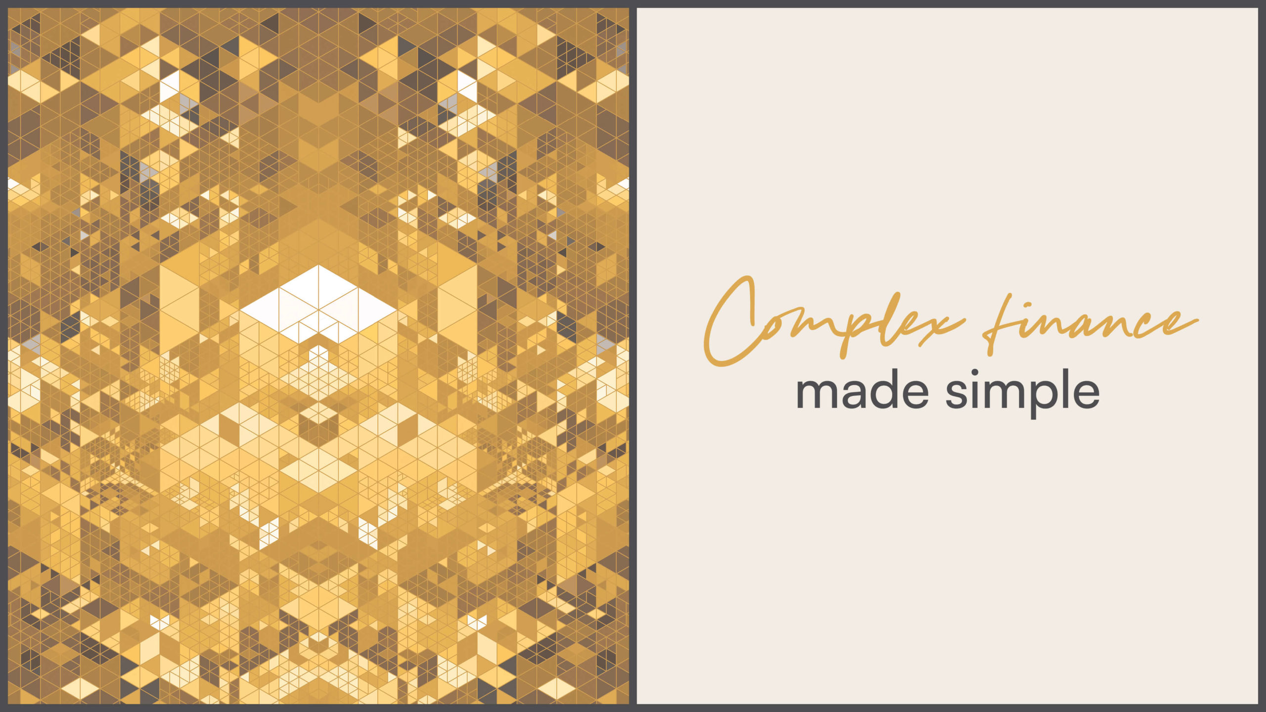
The visual approach to the branding represents the inherent advantage that ONE.IO gives to its customers – no longer needing multiple bank accounts to access and move their crypto related funds over to traditional currencies it can now all be done through one account – making complex finance simple.
This idea and approach, led to the choice of ONE.IO as the name and simplifying the complex became our guiding principle when creating every part of the visual identity.
Execution
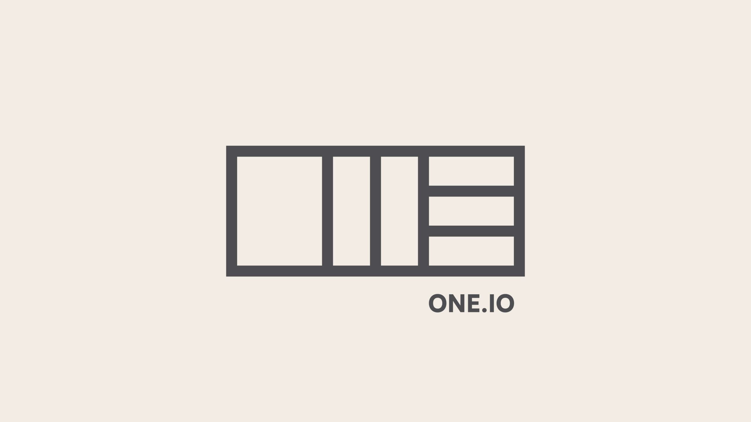
The logo is the simplest visual form that the word ONE could be made with. Formed from three equal sized blocks – the O remains in one piece the N is split into two pieces and the E split into three.
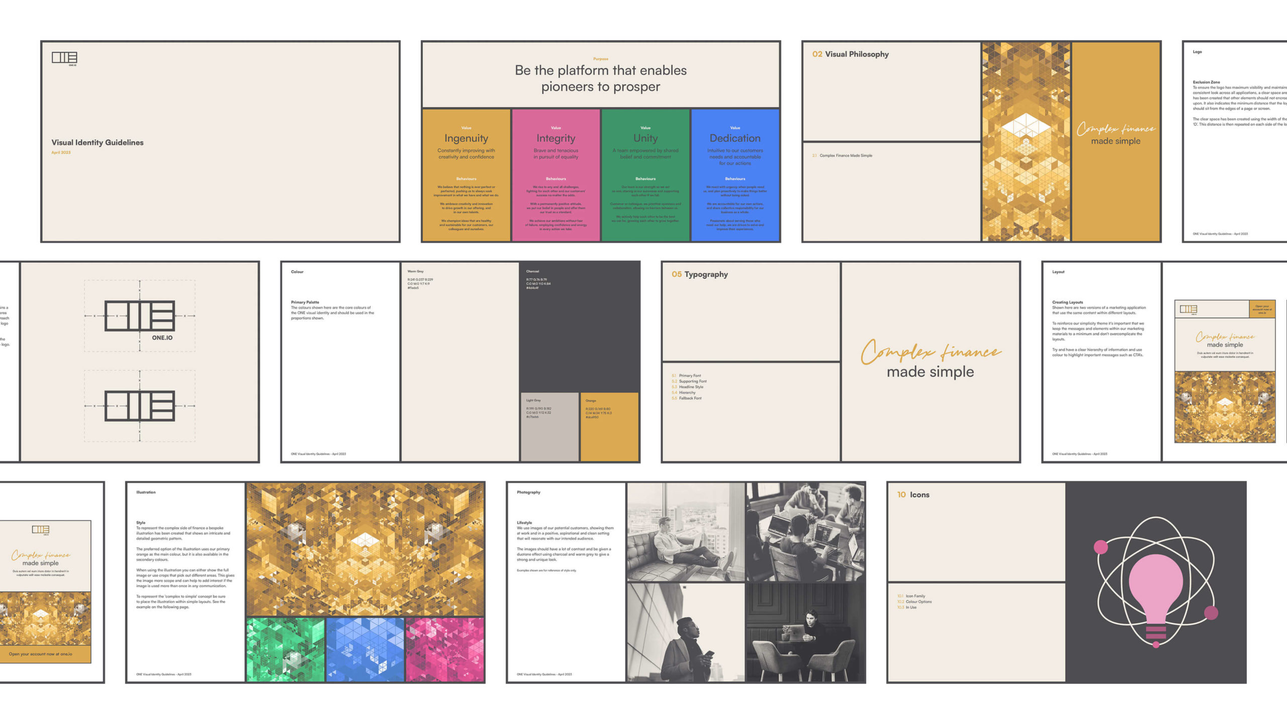
The typography used is a clean, clear and minimal sans serif. For main headlines this font is complemented by a handwritten font, used sparingly, to add energy and further express the idea of the complex made simple.
The colour palette is purposely restricted and carefully controlled in it’s use.
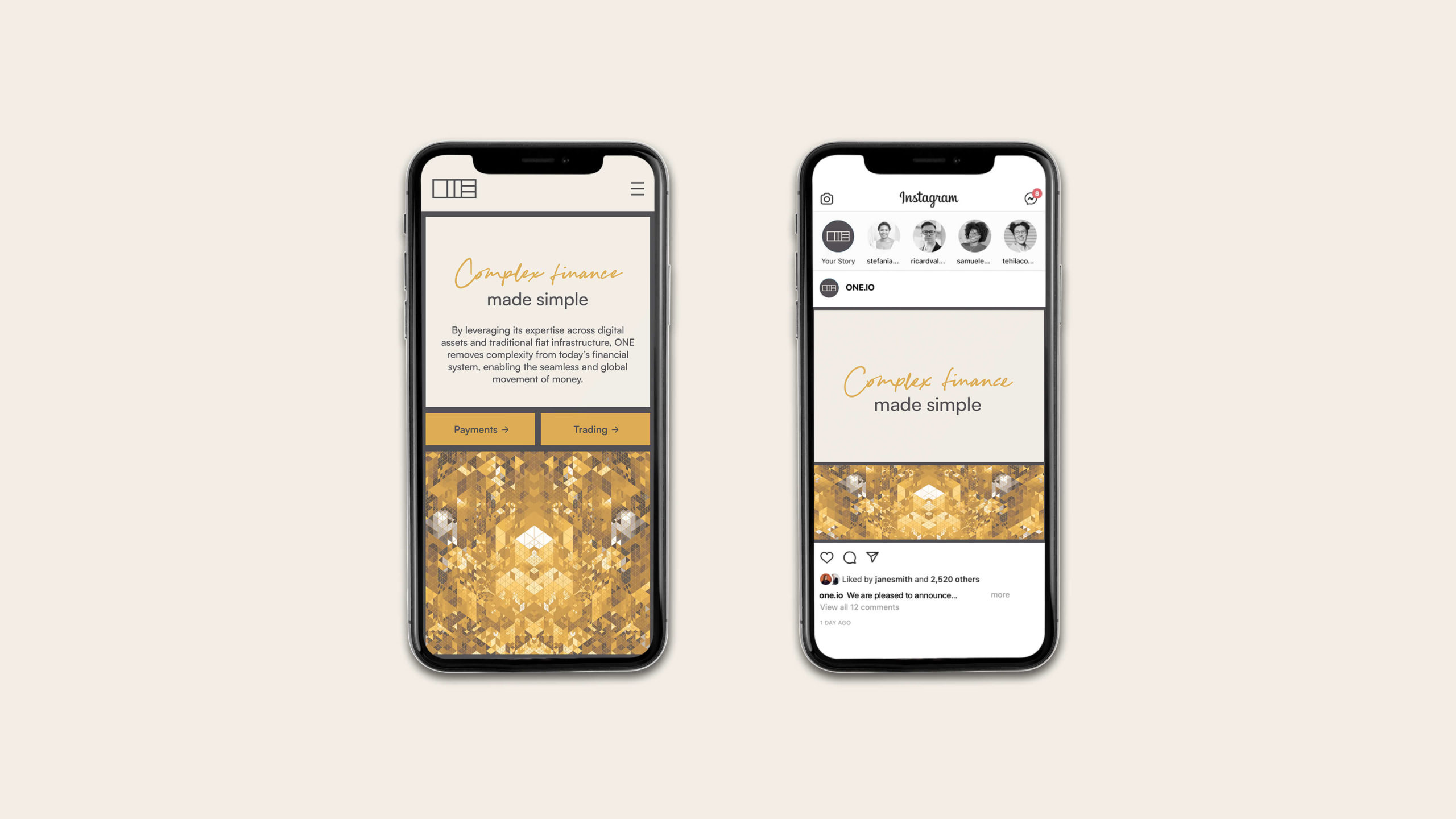
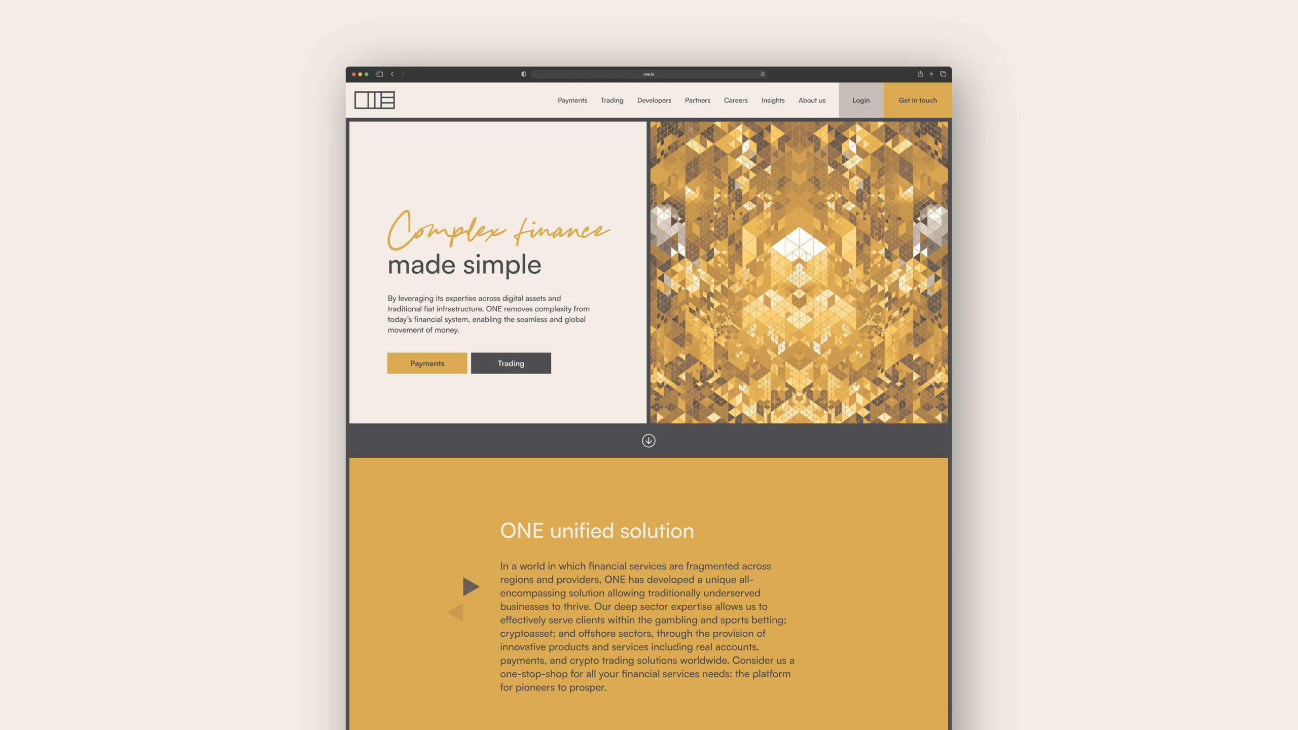
The layout and modular grid system reference the look of the logo and are inspired by modernist designs where form follows function and simple communication is key.
To balance this simplicity and add a counterpoint that references the complexity we commissioned a series of abstract illustrations that also give a sense of the digital nature of the business and allude to the world of crypto and blockchain.
