Acacium Group
Rebrand & Identity Overhaul
Health, social care and life sciences business, The Acacium Group (formally ICS) appointed B&D to assist in rebranding the core umbrella business and to restructure the 26 independent business within their portfolio. After many years of successful organic growth, it was time to take stock and regroup – Literally.
B&D completely overhauled their identity, from naming and visual identity to brand architecture, vision, values, purpose, marketing materials and tone of voice.
Deliverables
What’s in a name?
Naming a business is never an easy task, and it is even harder when that company is in a saturated market like the medical or life sciences sector. Think of a company name and it is probably already taken.
On top of this, we needed a name that reflect the proposed brand personality, resonate with six very different business units, and ultimately be available.
After 200+ naming options, we agreed upon Acacium – a coined name derived from the acacia tree. The name embodies growth, strength, strong roots and fortitude.
With the name set, we next moved onto the visual identity.

Bringing Acacium Group to life
The brand name was the main catalyst for the visual identity.
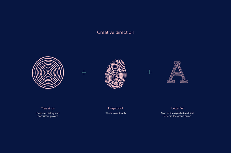
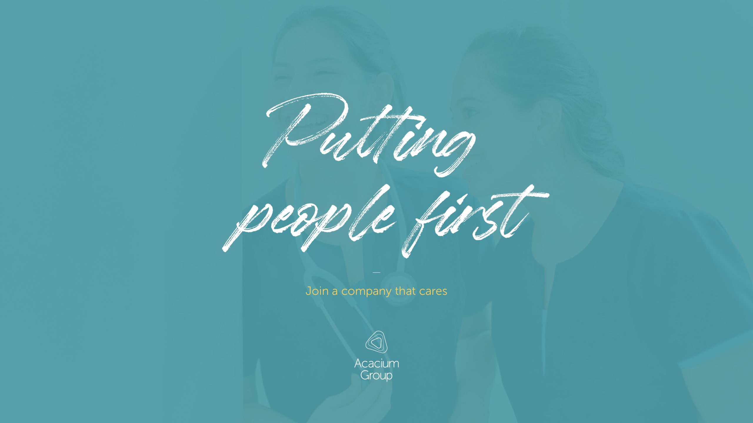
We devised a visual identity that reflected three core elements; a tree ring to show growth, a finger print to convey a human touch, and a stylised ‘A’ character.
From here we set about applying the icon as a graphic device. We embraced Acacium Group staff with the icon and applied it as a watermark across various marketing materials. We complimented the humanist san serif font Museo Sans with a hand drawn ‘voice’ typeface to convey a level of personality to the brand.
Finally, a photoshoot provided bespoke imagery for the Acacium Group to use alongside the design assets as opposed to relying on clichéd stock photography.
